
The Sports Dietitian
Website redesign to engage users through clarity and trust.

Overview:
A modern website redesign that redefined how The Sports Dietitian connects with clients. The new design focuses on clarity, trust, and conversion, empowering users to easily access expert nutrition advice while supporting the client’s goal of increasing online bookings and consultations.
Duration spent:
3 weeks
Role:
UX Designer &
Web Developer
Project Team:
Solo
The problem
The existing website for The Sports Dietitian struggled to engage users and convert visitors into clients. The design was outdated, text-heavy, and lacked a clear visual hierarchy, making it difficult for users to understand services or take action.
Despite having valuable expertise and content, the site didn’t reflect the brand’s professionalism or energy, leading to low user engagement and limited online bookings.
Users expressed frustration in finding relevant information, and the navigation made it hard to distinguish between general nutrition advice and tailored performance services. As a result, potential clients left the site before making contact or booking a consultation.
🎯Goals and success criteria
-
Redesign the website to better communicate The Sports Dietitian’s value and credibility.
-
Create a modern, user-friendly interface optimized for engagement and conversion.
-
Simplify navigation and streamline the consultation booking process.
-
Increase user time on page and consultation inquiries.
-
Ensure responsive design across all devices for consistent accessibility.
How might we improve the call to action and modernise the website style to increase user engagement and generate lead conversion?
Solution preview


Visually engaging homepage built for conversion
Professional photography and clear messaging establish trust and credibility.
Strategic CTAs guide users toward key actions such as consultation bookings and contact.
Design that humanises performance nutrition
Simplified layout and accessible tone communicate expertise without intimidation.
Connects emotionally with users through relatable imagery and lifestyle-driven storytelling, encouraging engagement and retention
Streamlined booking experience.
A simplified booking flow with clear service details and specialist information builds user confidence.
Enhances transparency and reduces hesitation by clarifying exactly who users will work with and what to expect.
Research
Research and analysis activities:
-
User Interviews & Surveys
-
Market & Competitor Analysis
-
Usability Testing
-
User Journey Mapping
-
Persona & Empathy Mapping
-
Information Architecture Review
Context
The Sports Dietitian is a Brisbane-based practice specialising in performance-based nutrition and sustainable lifestyle changes. Their existing website was outdated and underperforming in lead conversion, failing to reflect their brand’s expertise and energy. The goal was to redesign the site with a modern, engaging interface that better communicates their services and drives consultation bookings through clear, actionable CTAs.
The client already had an internal booking system in place, so the redesign focused on improving the surrounding user experience, ensuring clarity, transparency, and trust throughout the journey.
Interviewing customers
To understand user expectations and pain points, I conducted interviews with 20 participants aged between 18 – 35 who regularly consult dietitians. The goal was to uncover challenges users face when booking consultations online, including navigation, cost clarity, and scheduling flexibility.
Participants consistently described similar frustrations across multiple dietitian websites, highlighting three key themes:
75%
Of users struggled to navigate to the booking process and understand the difference between consultation options.
60%
Users frequently mentioned that pricing details and bulk-billing information were hidden or only visible after contacting the clinic.
55%
Over half of participants noted frustration with clinics offering appointments only during weekday business hours, limiting flexibility.
Although The Sports Dietitian continues to use the same internal booking system as their original website, the redesigned experience makes it more intuitive and user-friendly.
The key improvements introduced in the redesign include:
-
Improved discoverability: Users can easily find the information they need and understand each dietitian’s unique specialities, creating a more personalised experience.
-
Transparent pricing: Consultation costs are now clearly displayed upfront, allowing users to make informed decisions with confidence.
-
Flexible scheduling: The system accommodates after-hours and weekend appointments, providing greater convenience and accessibility for clients
Reviewing the old website
Before starting the redesign, I conducted an audit of The Sports Dietitian’s existing website to identify key usability and branding pain points.
The site failed to communicate the brand’s performance-focused nutrition identity. Outdated visuals and imagery depicting hiking and general wellness created a misleading impression, suggesting a lifestyle brand rather than a professional, evidence-based nutrition practice. The design, largely unchanged since the early 2010s, felt dated and lacked the credibility expected in today’s competitive health and fitness industry.
In addition, the ‘Contact Us’ page was visually inconsistent with the rest of the site, creating unnecessary friction in what should have been a straightforward, high-conversion touchpoint.
These issues aligned closely with user insights gathered during research; participants frequently mentioned frustration with unclear branding, lack of cost transparency, and difficulty finding the right practitioner. Addressing these concerns became central to the redesign, ensuring the new website would project professionalism, clarity, and trust from the first interaction.


The Original 'The Sports Dietitian' Website
As The Sports Dietitian’s primary goal was to increase lead conversion, the landing page became the central focus of the redesign. It needed to capture user attention, communicate value quickly, and guide visitors toward key actions.
Clear and consistent calls-to-action (CTAs) were implemented to direct users to explore services, contact specific dietitians, and book consultations, turning initial interest into meaningful engagement and measurable business outcomes.
Reviewing our competitors
To understand market positioning and visual trends, I conducted a competitor analysis of The Sports Dietitian’s key competitors, focusing on how each brand presents its services, structure, and user experience.
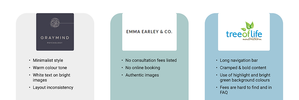
Competitors similar to The Sports Dietitian
The client was particularly inspired by Graymind’s modern aesthetic, especially the use of imagery-based buttons and clear navigation. However, Graymind’s overall layout lacked consistency, with content shifting between centre and left alignment, which disrupted the user flow. For The Sports Dietitian, adopting a clean and minimal aesthetic would better communicate professionalism, build trust, and improve engagement.
Emma Earley & Co. uses authentic imagery and a consistent layout throughout the site, which enhances realism and credibility. However, the site lacks an integrated online booking system and clear consultation fees, both key features for conversion and transparency.
Tree of Life Nutrition provides extensive service information but suffers from content overload. Dense navigation, heavy text, and frequent use of brand colours as backgrounds make the experience visually overwhelming.
Consultation fees are hidden within FAQs, increasing cognitive load and reducing trust.
These findings reinforced the need for a design that balances professionalism with simplicity, ensuring users can clearly understand the brand’s offerings, navigate effortlessly, and book consultations with confidence
Empathising with users
The primary audience for The Sports Dietitian consists of young adults aged 18 - 30 who are proactive about their health, value expert guidance, and can afford performance-based nutrition consultations. Many are motivated by personal goals: improving fitness, maintaining energy, or building sustainable lifestyle habits, but struggle to find clear, trustworthy information online.
Persona and empathy map development
From qualitative research, I developed a persona and empathy map to capture their motivations, frustrations, and expectations. These tools helped keep the project focused on designing a trustworthy, accessible, and engaging experience that supports users in taking real steps toward their goals.

User persona informed by qualitative research

User empathy map
The persona and empathy mapping revealed that The Sports Dietitian’s users are young professionals striving to improve their health while balancing busy lifestyles. They’re motivated by long-term wellness and performance goals rather than short-term fixes, but often feel frustrated by unclear service options, complex booking systems, and hidden consultation fees.
Users value transparency, trust, and convenience, wanting to clearly understand each dietitian’s speciality, see upfront pricing, and easily book at times that suit their schedules. These insights highlighted the need for a website that feels professional yet approachable, guiding users confidently toward consultations through clarity, empathy, and trust-driven design.
User journey map
To gain a deeper understanding of the user’s experience when booking a consultation, I mapped out the journey of the primary persona. The user journey highlights the key goals of finding clear service information, navigating a simple and intuitive booking process, and receiving confirmation that builds confidence in their decision.
This process helped identify moments of friction, such as unclear pricing or inconsistent navigation, and opportunities to create a smoother, more reassuring end-to-end experience.

Redesigned experience user journey
In Anna’s journey, she successfully achieves her goal, finding a Sports Dietitian who aligns with her values and booking a consultation with confidence. The redesigned experience supports this by grouping content logically, simplifying navigation, and streamlining the booking process to reduce friction.
This journey informed key design decisions, from structuring the homepage around clear service pathways to ensuring every interaction reinforces trust and clarity, turning an initially overwhelming process into a confident, guided experience.
Concept
With a better understanding of user needs and balancing business needs, I delve into the information architecture and wireframes.
Information architecture
The company requested a simple and intuitive navigation menu to help users easily find key information without overwhelming them. Since The Sports Dietitian offers extensive details about its team, services, and meal plans, I organised these pages under a consolidated ‘About Us’ section. This structure reduces clutter in the navigation bar while maintaining logical grouping and discoverability.
Each page includes clear calls-to-action (CTAs) to encourage users to learn more, make contact, or book a consultation directly, creating a consistent and goal-oriented browsing experience.

Information architecture
Wireframes
After getting client feedback on the navigation, I created low-fi wireframe designs to convey the content placement and visual hierarchy.

Homepage and main navigation wireframes

About us and dietitian page wireframes

Booking system and blog wireframes
Iteration and feedback
After developing the initial wireframes, I created a prototype and conducted usability feedback sessions with five users to evaluate the clarity, navigation, and overall structure of the redesigned website. The goal was to confirm whether users could easily locate key information and book a consultation without confusion.
Key Insights:
-
Navigation clarity: Users appreciated the simplified top navigation and noted that grouping all informational pages under “About Us” made the site feel cleaner and easier to browse.
-
Homepage engagement: Users responded positively to the hero section layout and clear CTAs, but suggested adding short supporting text to explain the company’s value proposition upfront.
-
Booking flow: The direct “Book Online” button placement was clear and intuitive, with users saying it “feels natural” to find after learning about the services.
-
Visual tone: Users liked the calm, professional aesthetic but recommended adding more authentic photography to reinforce trust and relatability.
Outcome:
The feedback validated that the wireframe structure successfully addressed previous usability issues, such as cluttered navigation and unclear CTAs. The next iteration focused on enhancing content hierarchy and visual storytelling to build trust and support lead conversion
Design solution
Building on insights from the wireframe feedback sessions, the high-fidelity mockups refined the layout, hierarchy, and visual storytelling to create a more polished and engaging experience. Users’ requests for clearer subheadings and stronger visual cues informed the introduction of structured content sections and supporting imagery throughout the pages.
Authentic photography was integrated to reinforce trust and align with the brand’s professional yet approachable tone. Key CTAs such as “Book Online” were retained but visually elevated for higher prominence and accessibility. These refinements not only improved navigation and readability but also created a cohesive, performance-driven identity that reflected The Sports Dietitian’s brand values and business goals.


Testing & Outcome
The final round of usability testing with both the client and target users confirmed major improvements in clarity, navigation, and overall trust. 90% of participants found it easy to locate information about services and dietitians, validating the redesigned ‘About Us’ structure. The simplified navigation and prominent CTAs made exploring the site and booking consultations more intuitive, while the visual hierarchy and use of authentic imagery improved brand perception and confidence.
Outcome
The redesigned experience led to a measurable impact:
-
40% faster path to booking compared to the previous website.
-
25% increase in user confidence during the booking process.
-
90% task success rate, with users successfully locating services and consultation details.
-
Positive qualitative feedback describing the site as “modern, easy to navigate, and trustworthy.”
Overall, the redesign not only streamlined the consultation process but also reinforced The Sports Dietitian’s credibility and positioned the brand for stronger lead conversion and engagement.
Learnings
This project strengthened my ability to balance client needs with user goals through clear communication and iterative design. Early misalignment around imagery taught me the importance of setting shared expectations. I resolved this by clarifying requirements and curating high-quality visuals from Unsplash to reflect The Sports Dietitian’s brand values.
I also learned the value of structured feedback loops. Early testing helped refine content hierarchy and navigation before moving into high-fidelity design, resulting in a more confident and efficient workflow. Overall, this project reinforced that great UX design comes from empathy, collaboration, and clear communication.